01.BLACKTOWN MUSIC FESTIVAL
Visual Identity Design
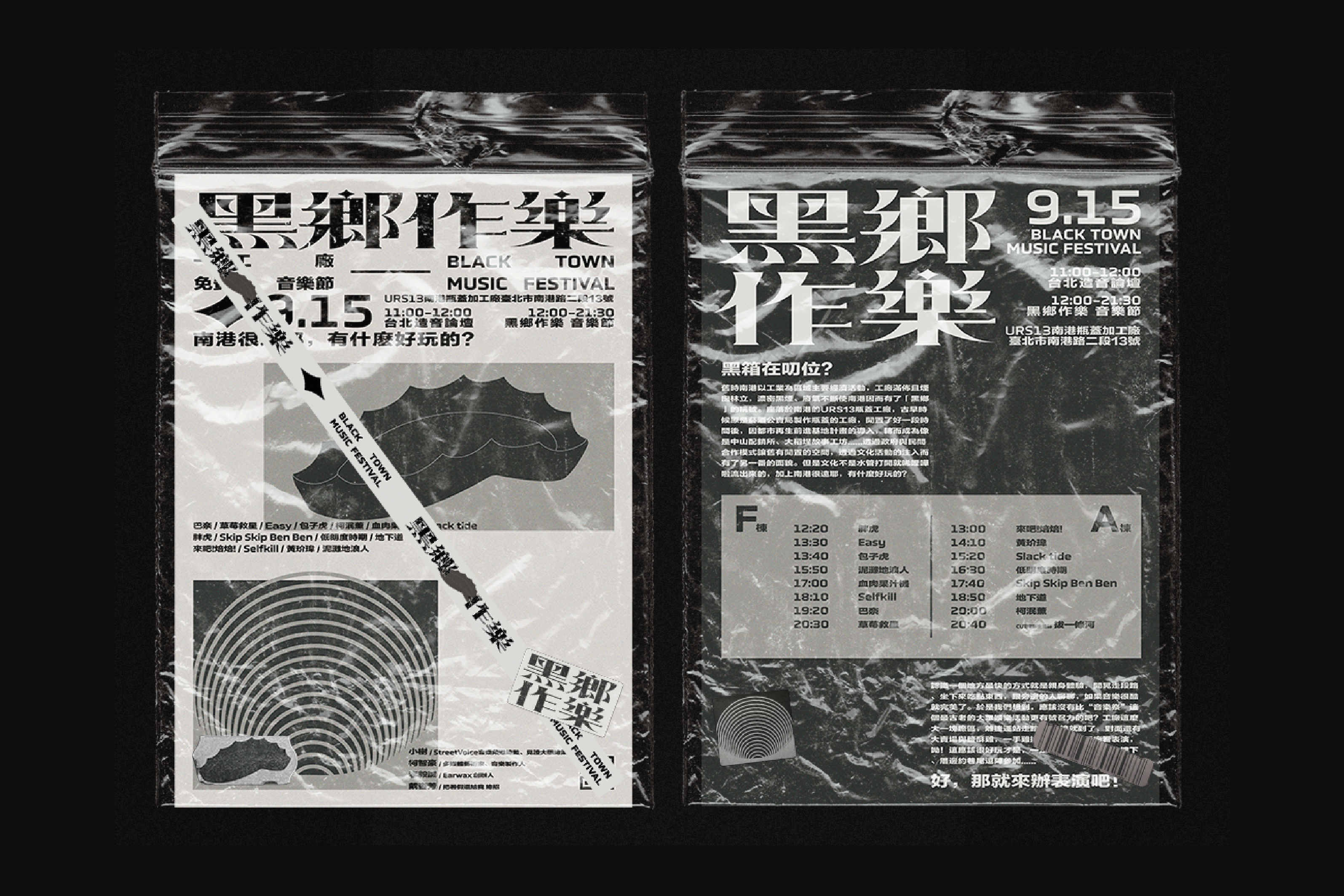
The Black Town Music Festival is situated in Taipei's NanGang District. In the past, Industry served as the primary source of income. Back then, the area was surrounded by factories and chimneys that continuously produced thick, black smoke and exhaust gas. This is how "Black Town" got its moniker.
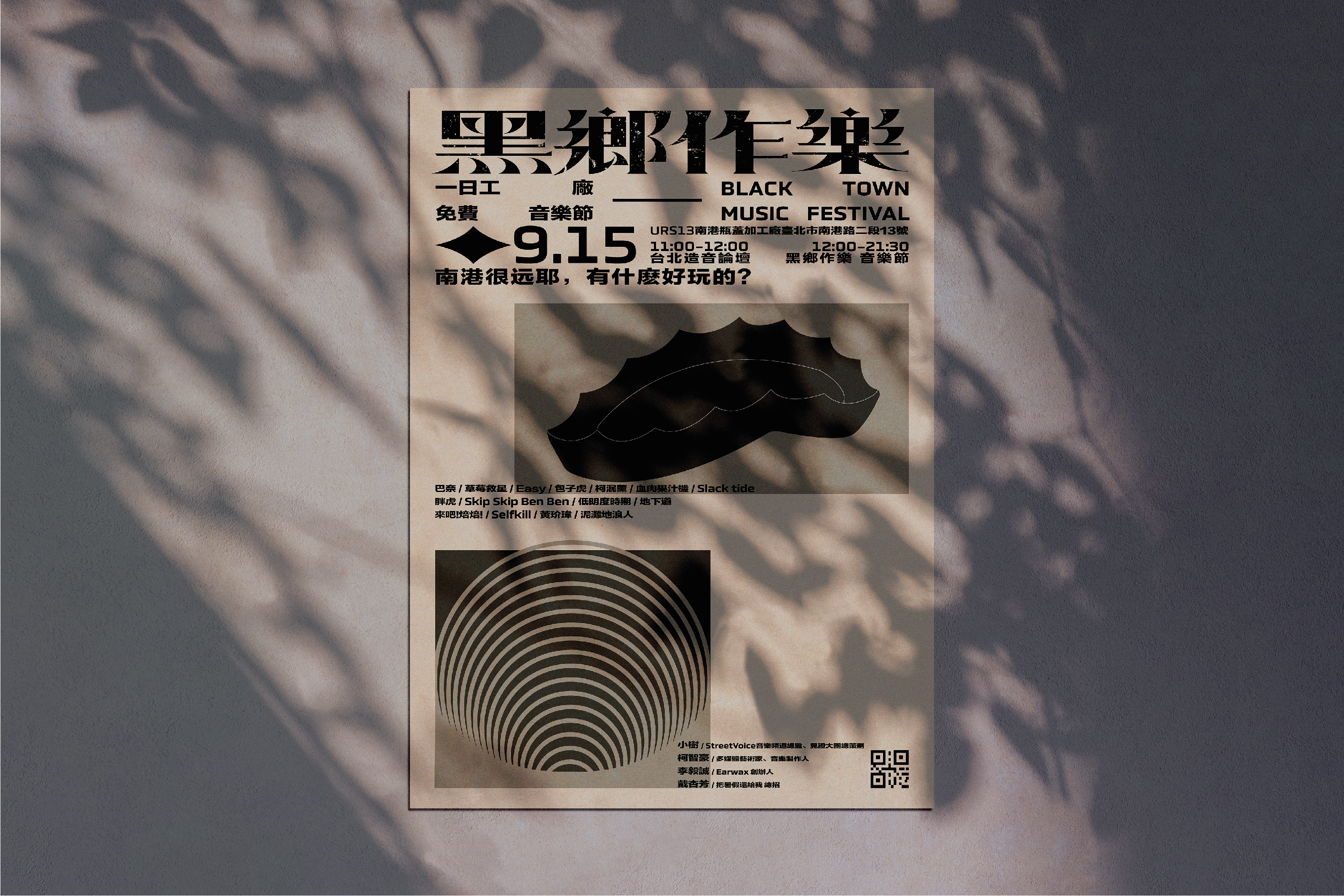
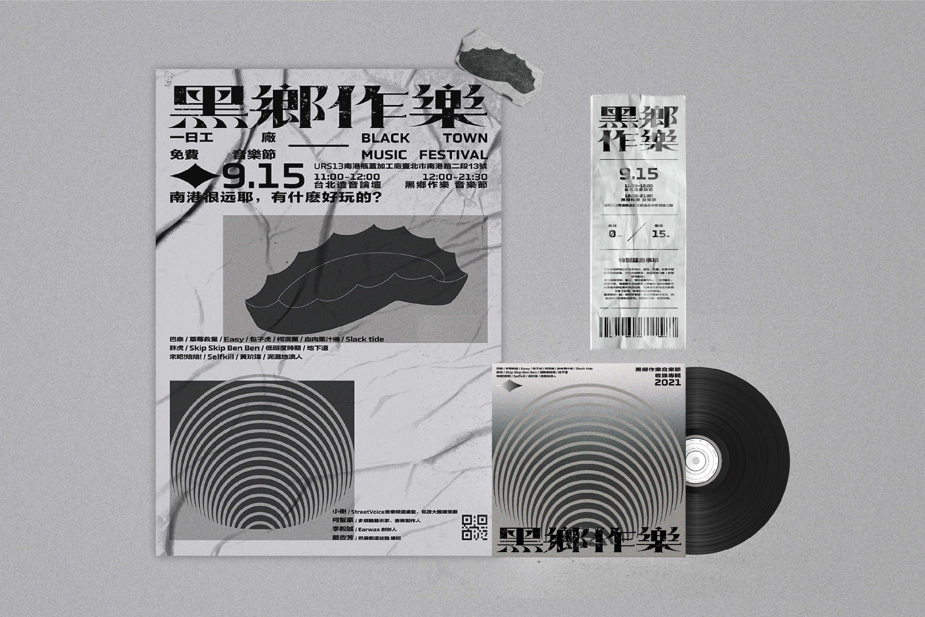
The overall objective of the design is to provide this music festival with a distinctive visual character. Since I think that the physical location of the music festival is a significant component, I concentrated on the whole vibe and idea that "Black Town" brought to it. Therefore, I wanted to incorporate this location's dark and smokey vibe into the design.
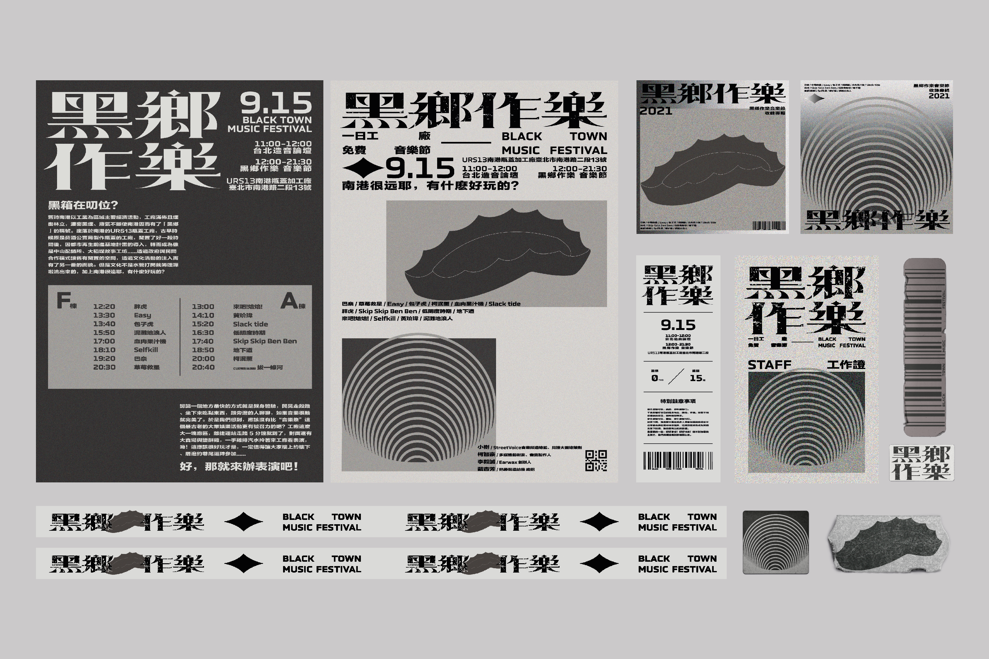
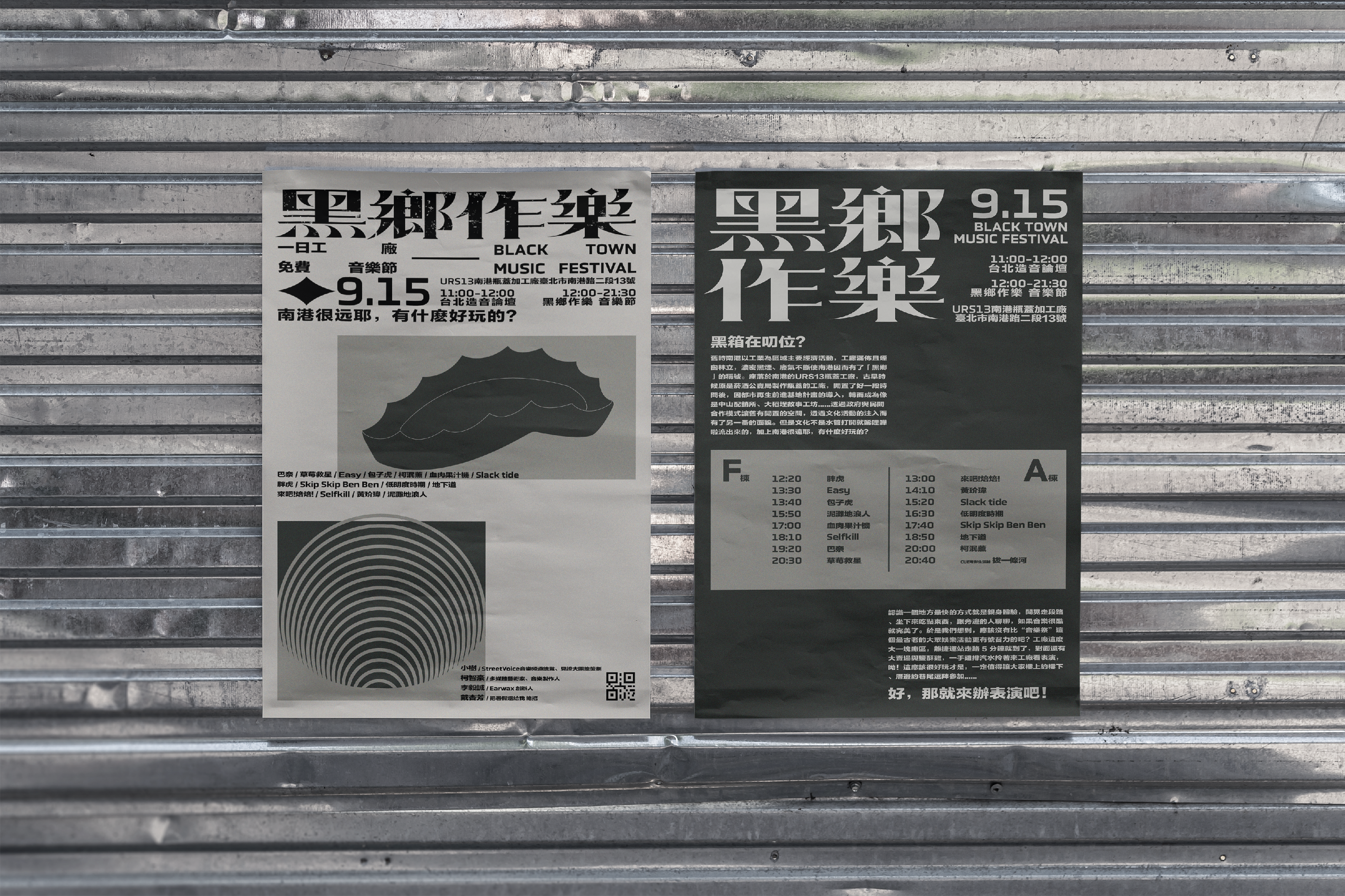
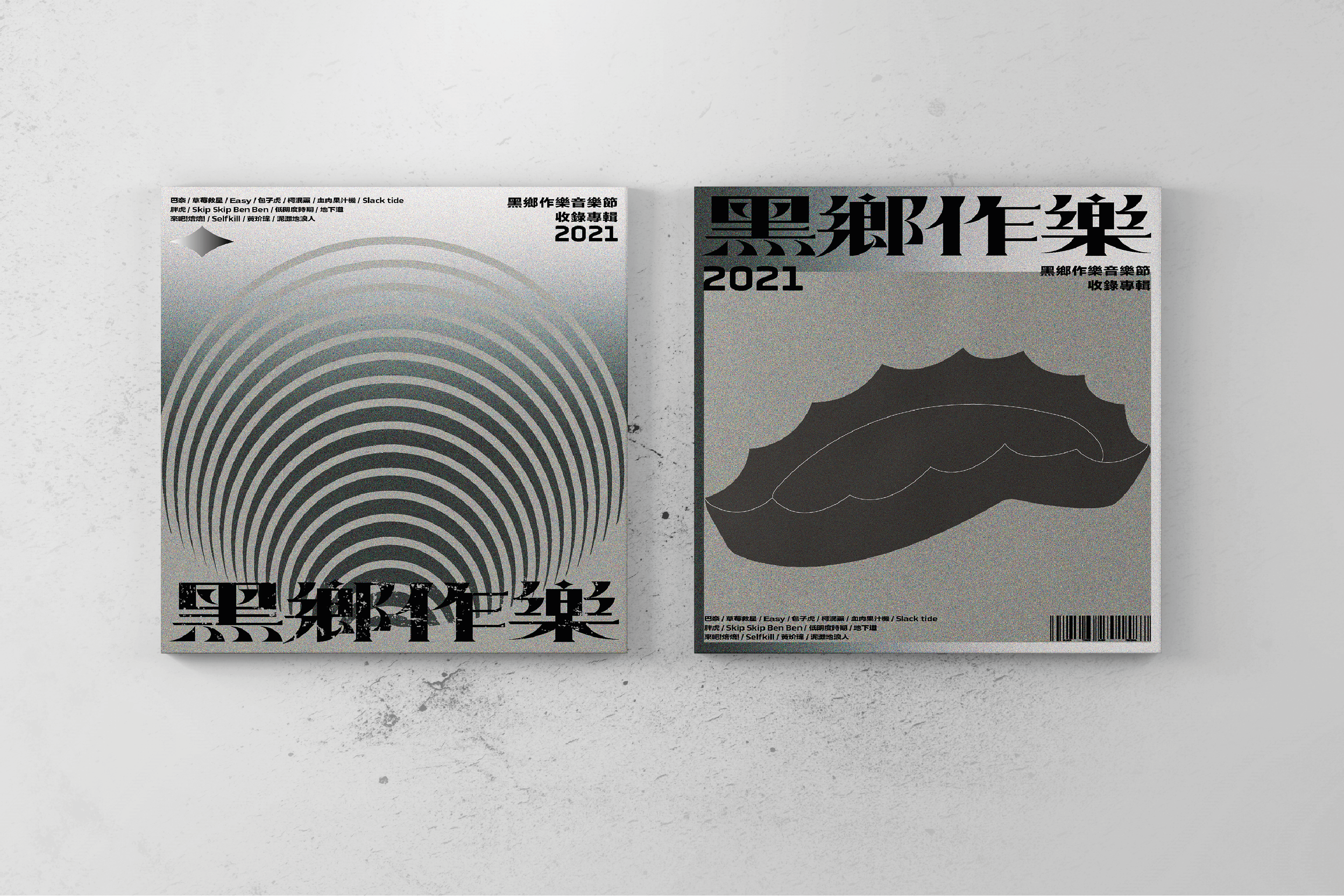
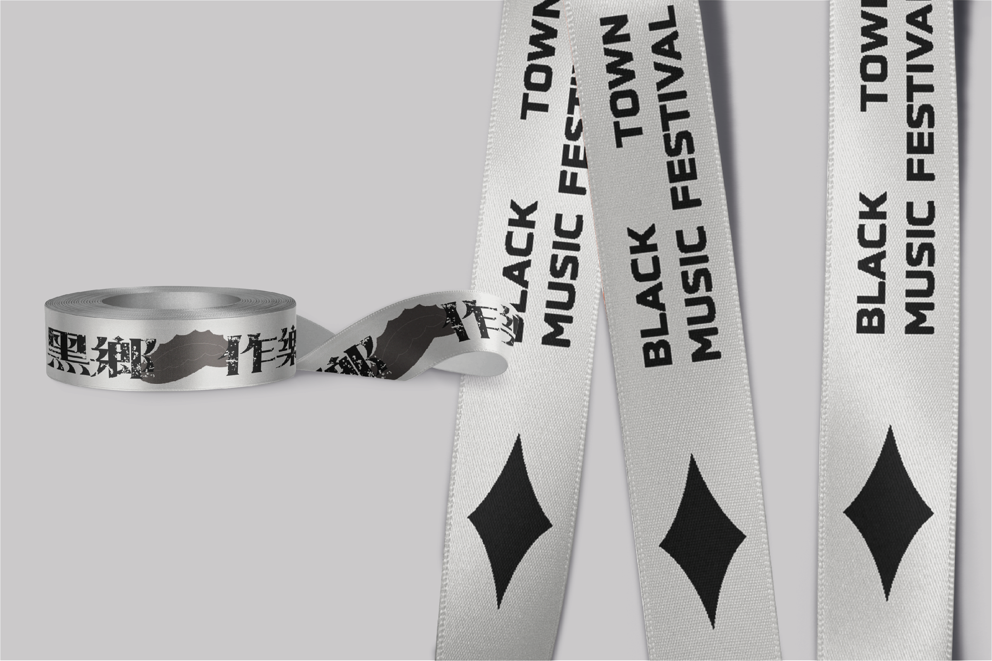
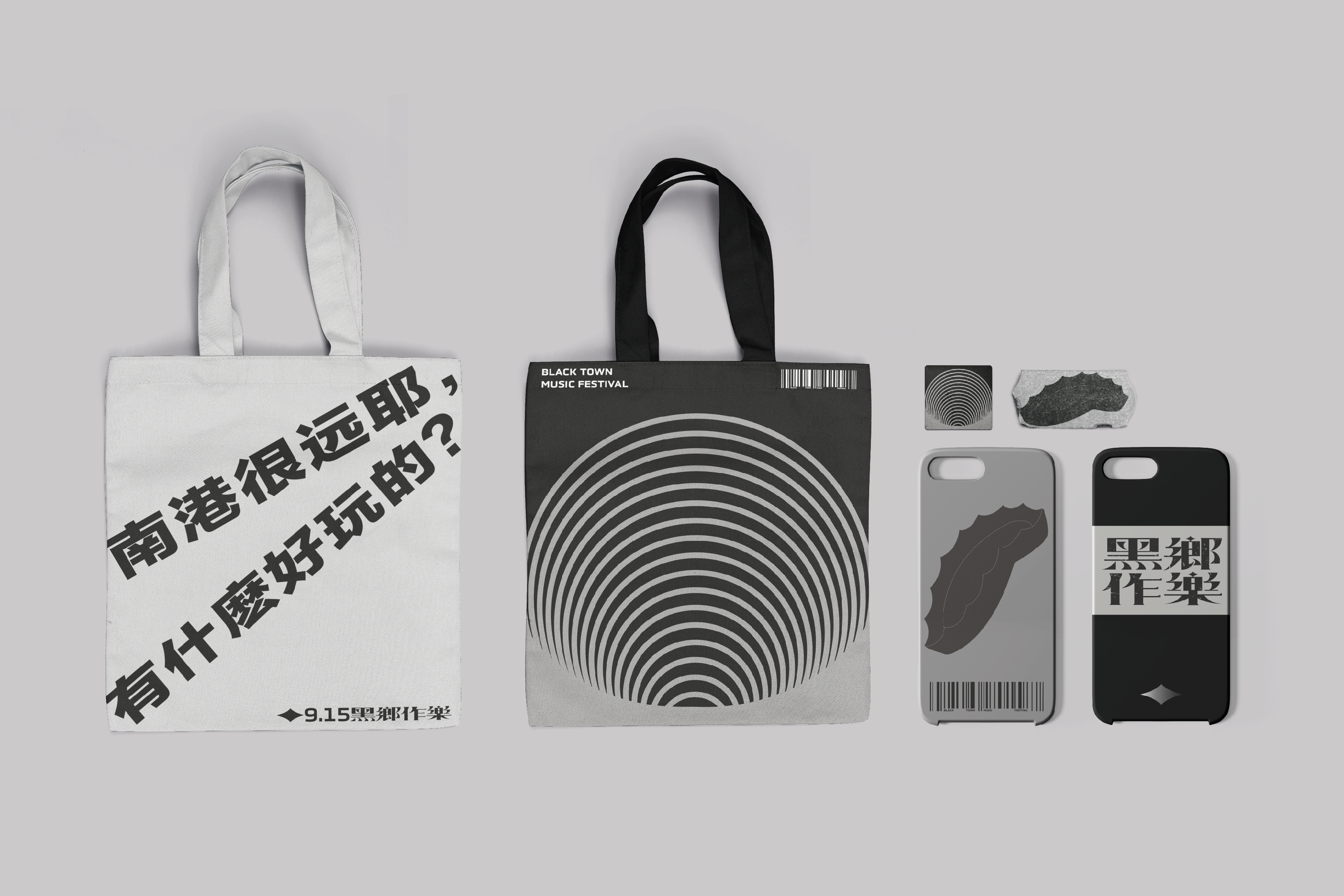
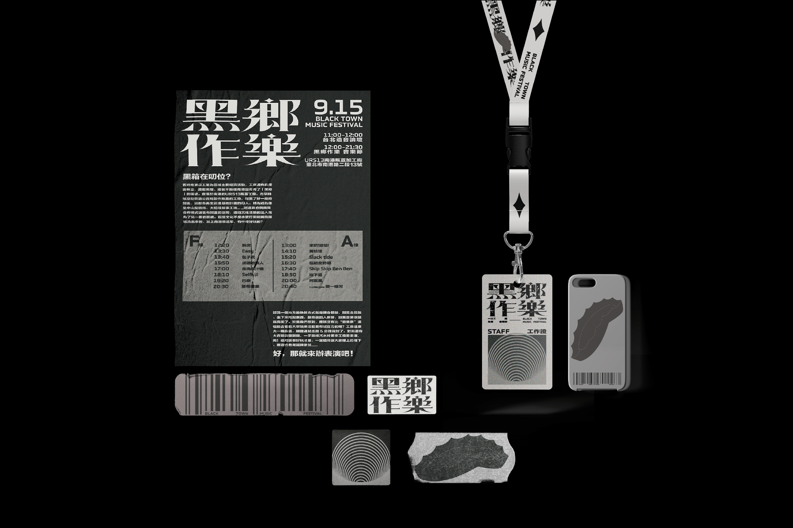
The entire design consists of two main posters, and many peripheral items like tickets, CD sets, work permits, canvas bags, and so on. I went with black and grey tones for the color scheme and I created two main patterns: a beer cap and a smoke representation pattern to run through the entire design. Almost all the peripheral products feature them in some capacity, adding uniformity and personality to the design.
To add some elegance and refinement to the generally rough style, I significantly distinguished the font stroke thickness. Additionally, it differentiates the logo largely from alternative font choices. To emphasize the locality and history of this music festival, I also maintained a few elements of traditional calligraphy.

